 The Title is placed in the top third of the magazine and is written in a serif font, the serif font represents the magazine as sophisticated and redoubtable. This makes the target audience, 20-40 year olds who are in the A and B classes.
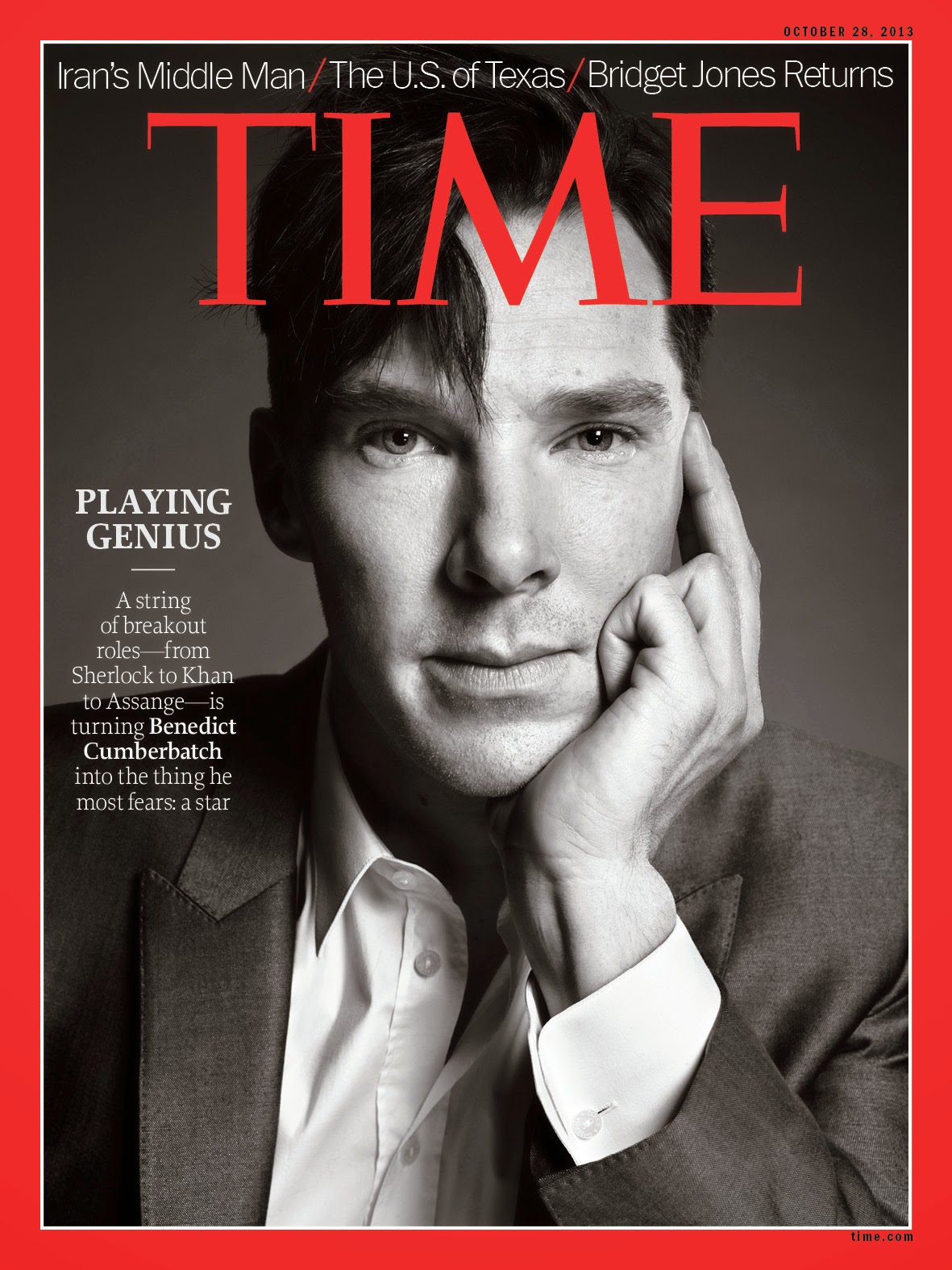
The central image of Benedict Cumberbatch is very minimalistic and as a result allows the reader to focus on the text and the magazine itself, unlike other magazines that have an abundance of gossip and adverts on the cover.
The Colour scheme is again, very simple and consists of red, black and white. Red is an extreme authoritative colours which may be due to the fact that the magazine is aimed at people who have authority over others, such as managers and professionals.
No comments:
Post a Comment